Jan 10, 2017Last modified July 10, 2025
CSS Deep Dive
Box Model
- Everything displayed using css is rendered as a box. This is generally referred to as the box model.
- The box model consist of four parts - content, padding, border and margin.
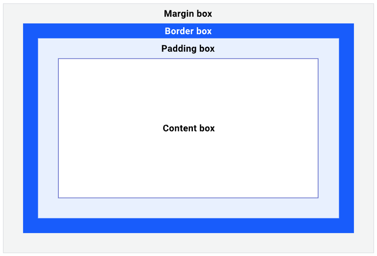
- By default the actual width of the element is the width of the content + padding + border. This is because the box-sizing property is set to content-box. You can change this by setting the box-sizing property to border-box. border-box will push the border and padding into the width of the element.
Selectors
- Selectors provide us with ways to uniquely identify a set of elements from DOM tree.
- Whenever you want to apply specific styles to a element in your HTML, you need to use a selector.
- In below css rule structure, the selector is the part that comes before the curly braces.
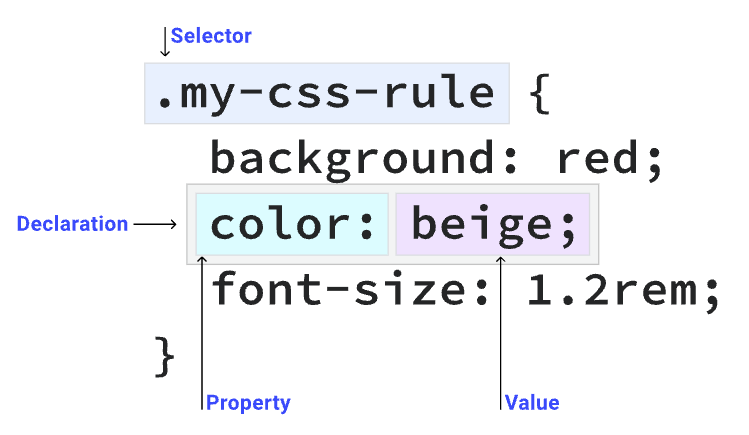
CSS Rule Structure. Image Credit : https://web.dev/learn/css/selectors
- The different type of selectors include universal selector, type selector, class selector, id selector, attribute selector, pseudo-class selector, pseudo-element selector, and combinator selector.
- The cascade is the algorithm for solving conflicts where multiple CSS rules apply to an HTML element.
- The cascade algorithm is split into 4 distinct stages.
- Position and order of appearance: the order of which your CSS rules appear
- Specificity: an algorithm which determines which CSS selector has the strongest match
- Origin: the order of when CSS appears and where it comes from, whether that is a browser style, CSS from a browser extension, or your authored CSS
- Importance: some CSS rules are weighted more heavily than others, especially with the !important rule type
Inheritance
- Inheritance is a mechanism by which properties are applied to an element based on the properties of its parent element.
Sizing units
- If you want to limit the number of characters in a particular element use the ch unit. This unit is based on the width of the "0" character.
- When specifiying line heights, try to use unit less values as they are calculated based on the font size of the element. This way when the line height value gets inherited by child elements, it will be adopt to the font size of the child elements.
- The transform property allows you alter an element's appearance and position by rotating, skewing, scaling and translating it. This can be done in a 2D and 3D space.
Layout
- The display property in css does two things
- It sets how an element will be displayed ie. either as a inline element along side other elements or as a block element rendering itself on new line and taking up available horizontal space.
- It decides how the children elements will behave. For example, if you set the display property of an element to flex, then its children elements will behave as flex items.
- There are two main layout mechanisms in css - flexbox and grid.
- When we havent specified one of these layouts, the default layout is called normal flow or flow layout.
Position
- You can position any element in page using the position property. There are five different values for the position property.
- static - This is the default value. It means that the element is positioned according to the normal flow of the page.
- relative - This value allows you to position an element relative to its normal position.
- absolute - This value allows you to position an element relative to its closest positioned ancestor.
- fixed - This value allows you to position an element relative to the viewport.
- sticky - This value allows you to position an element relative to the viewport, but only when the element is scrolled to a certain point.
Flexbox
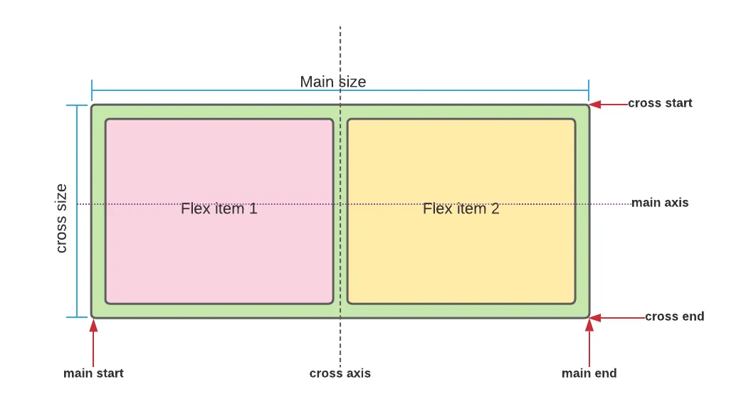
- flexbox is layout mechanism for one dimentional layouts.
- By default, flex items are laid out in a row, in inline fashion.
- Items will stay on the same axis and not wrap when they run out of space. Instead they will try to squash onto the same line as each other. This behaviour can be changed using the align-items, justify-content and flex-wrap properties.
- Flexbox also converts the child elements to be flex items, which means you can write rules on how they behave inside a flex container. You can change alignment, order and justification on an individual item.
- This flex container has a writing-mode of vertical-rl. A row now runs vertically.
- If you want the items in flex container to wrap, you can use the flex-wrap property. By default this is set to nowrap. You can set it to wrap or wrap-reverse.
- When you set th flex-wrap property to wrap, the items will wrap onto a new line when they run out of space.
- If you are working on the main axis then the properties begin with justify-. On the cross axis they begin with align-.
- To set both justify-content and align-content you can use place-content with one or two values. A single value will be used for both axes, if you specify both the first is used for align-content and the second for justify-content.
Grid
( points credit )
- Grid is a layout method designed for two-dimensional content. That is, laying things out in rows and columns at the same time.
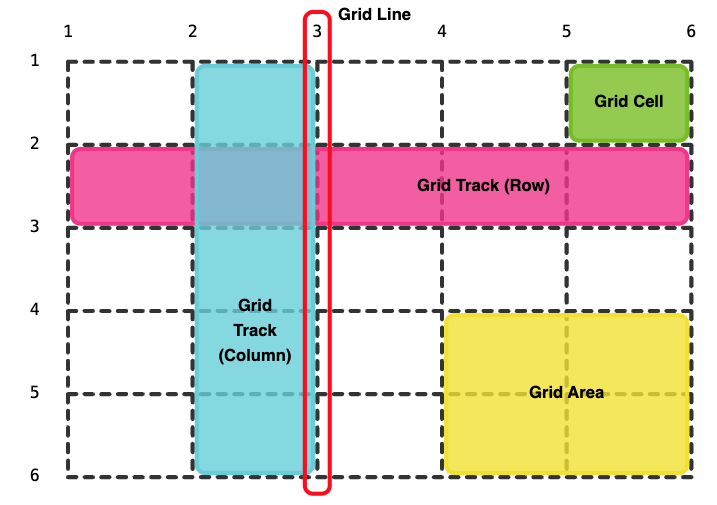
- To use grid layout, you jusst need to set the display property to grid or inline-grid.
- To decide the structure of the grid, you can use grid-template-rows, grid-template-columns and grid-template-areas properties.
- The grid-template-rows property defines the height of each row, and the grid-template-columns property defines the width of each column.
- You can use the grid-row-gap and grid-column-gap properties to set the size of the gap between rows and columns.
- Here's how you can design a responsive grid layout using CSS Grid Layout.
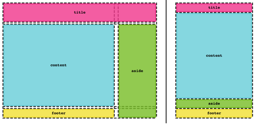
- The fr unit, a flexible length which describes a share of the available space in the grid container. The fr unit works in a similar way to using flex: auto in flexbox. It distributes space after the items have been laid out.
- The children of a grid container are called grid items. They can be positioned in the different parts of the grid using the placement properties grid-row-start, grid-row-end, grid-column-start, and grid-column-end. But in most cases you’ll be using the shorthands grid-row, grid-column, and grid-area.
Custom properties & var()
- CSS allows you to define custom properties. You can define a custom property by prefixing the property name with --.
- You can then use the var() function to use the custom property. The second parameter the var function is a fallback value. If the custom property is not defined, the fallback value will be used.
Functions
- CSS supports in built functions which we can use while calculating values for css properties. There are some functions which we can use with selectors as well.
- Some of the examples of css functions are calc(), rgb(), hsl(), url(), attr(), etc.
- We can't define custom functions in CSS.
Z-index
- HTML elements can be stacked on top of each other. This is achieved using the z-index property. The defalt value of z-index is 0.
- The z-index property specifies the stack order of an element. An element with greater stack order is always in front of an element with a lower stack order.
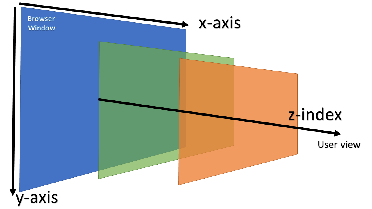
- Higher the z-index value, close the element is to the user.
- z index value is appicalble in the context of parent element. This is knonw as stacking context.
Overflow
- The overflow property specifies what happens if content overflows an element's box.
- The overflow property has the following values:
- visible - Default. The overflow is not clipped. The content renders outside the element's box
- hidden - The overflow is clipped, and the rest of the content will be invisible
- scroll - The overflow is clipped, and a scrollbar is added to see the rest of the content
- auto - Similar to scroll, but it adds scrollbars only when necessary
- Use the text-overflow property on any element that contains text node(s), for example a paragraph p tag.
- To use text-overflow you need a single unwrapped line of text, so you must also set overflow to hidden and have a white-space value that prevents wrapping.
- The overflow-y property controls physical overflow along the vertical axis of the device viewport, therefore scrolling up and down.
- The overflow-x property controls overflow along the horizontal axis of the device viewport, therefore scrolling left and right
Text & Typography
- In CSS, @font-face and font-family are often confused, but they serve distinct purposes.
- @font-face is a rule used to define any custom fonts you want to use in your web application. It tells the browser where to download the font, how to display it during loading (with the font-display property), and specifies which subset of characters to download (with the unicode-range). A page's web fonts are defined in a style sheet using a @font-face declaration.
- In contrast, font-family is a CSS property used within a CSS rule to assign a particular font or a list of fonts to an element. The fonts listed under font-family can be web-safe fonts, system fonts, or custom fonts defined with @font-face.
- To summarize, @font-face declares a font and gives it a name, and font-family applies this declared font to HTML elements.
- Use writing-mode to change the way text flows and is arranged. The default is horizontal-tb, but you can also set writing-mode to vertical-lr or vertical-rl for text that you want to flow horizontally.
CSS Preprocessors
- CSS preprocessors are scripting languages which allow us to extend the css language by adding features such as variables, mixins, functions, and mathematical operations.
- Some of the popular CSS preprocessors are Sass (Syntactically Awesome Style Sheets), SCSS(Sassy CSS), Less(Leaner CSS), Stylus.
- Why we needed CSS preprocessors ?
- Originally css didnt had support for variables. This caused a lot of redundant css styles across the application.
- CSS didnt have support for nesting. This lead to css files becoming very large and hard to maintain.
- CSS didnt have support for mixins or custom functions.
- CSS didnt have support for math operations.
- CSS didnt have support for importing files.
- CSS preprocessors are sometimes equated with PostCSS, but they’re not the same thing. PostCSS is a popular JavaScript library that allows us to automate CSS-related tasks once CSS code is ready to be published. It’s a CSS postprocessor that we can use for things such as auto-prefixing, linting, support experimental features, and many others.
Performance optimizations
CSS
- CSS is a render blocking resource.
- One of the first ways to optimize css is to minify the css.minify css. This is achieved by removing the unnecessary whitespace, comments and other invisible characters. Bundlers like Webpack and Rollup can do this for us.
- Remove unused CSS. This can be done by using a tool like PurgeCSS.
- While it may seem convenient, you should avoid @import declarations in CSS:
- You can replace the @import by using a link rel="stylesheet" element. link elements allow style sheets to be downloaded concurrently and reduces overall load time, as opposed to @import declarations, which downloads style sheets consecutively.
- Inline critical CSS. This is the CSS that is required to render the page. This can be done by inlining the CSS in the head of the document.
Fonts
(1)
- The fonts used in a web page are downloaded only after all the HTML, CSS, and JavaScript files have been downloaded. This can cause a delay in rendering the page, especially if the fonts are large or if the user has a slow internet connection.
- You can nudge the browser to download the font files sooner by using the preload directive.
- The preload directive should be used carefully. Overuse of the preload directive may divert bandwidth from other critical resources. If used excessively, preload directives may download fonts that are not needed for the current page
- Additionally, it's also important to note that fonts are CORS resources. As such, you must specify the crossorigin attribute when preloading fonts, even if they're self-hosted.
- As font files can contain executable code, there is a inherent security risk associated with loading them. Without CORS restrictions, malicious sites could potentially load fonts from other domains and exploit them. Font files can sometimes reveal information about the user's system or be used in fingerprinting attacks
(2)
- If you are loading fonts from google, additional time is required to establish a connection to the Google Fonts server. This can cause a delay in rendering the page, especially if the user has a slow internet connection.
- You can use the preconnect directive to establish a connection to the Google Fonts server sooner.
- You can save more time by self hosting the fonts. If you plan on self-hosting web fonts, check that your site is using a Content Delivery Network (CDN), HTTP/2 or HTTP/3, and sets the correct caching headers for the web fonts you need for your website.
(3)
- By default, the browser blocks the rendering of any text that uses a web font until the it's downloaded.
- You can use the font-display property to control how the browser displays text while the font is loading. You can use swap value for this property to render the text using the fallback font while the web font is loading.
- However, the downside of swap is that it causes a layout shift if the fallback web font and the web font specified in your CSS varies greatly in terms of line height, kerning, and other font metrics.
Images
- The img element supports the srcset attribute, which lets you specify a list of possible image sources the browser may use. Each image source specified must include the image URL, and a width or pixel density descriptor.
- Each image source specified must include the image URL, and a width or pixel density descriptor.
- Physical Device Pixels (Hardware Pixels)
- These are the actual, tiny light-emitting elements on your screen - the literal hardware dots that make up the display. A 1920×1080 monitor has exactly 1,920 × 1,080 physical pixels arranged in a grid. These are fixed by the hardware and represent the screen's native resolution.
- CSS Pixels (Reference Pixels)
- CSS pixels are an abstract unit of measurement used by web browsers and operating systems. One CSS pixel doesn't necessarily correspond to one physical pixel. Instead, it's designed to be roughly 1/96th of an inch at typical viewing distances, regardless of the actual screen density.
- It's possible to tell the browser to lazy load images when they appear in the viewport using the loading attribute. An attribute value of lazy tells the browser to not download the image until it is in (or near) the viewport.